Themes
ChartTheme is the base visual skin for the chart and standalone widgets. It is accepted at construction and at runtime.
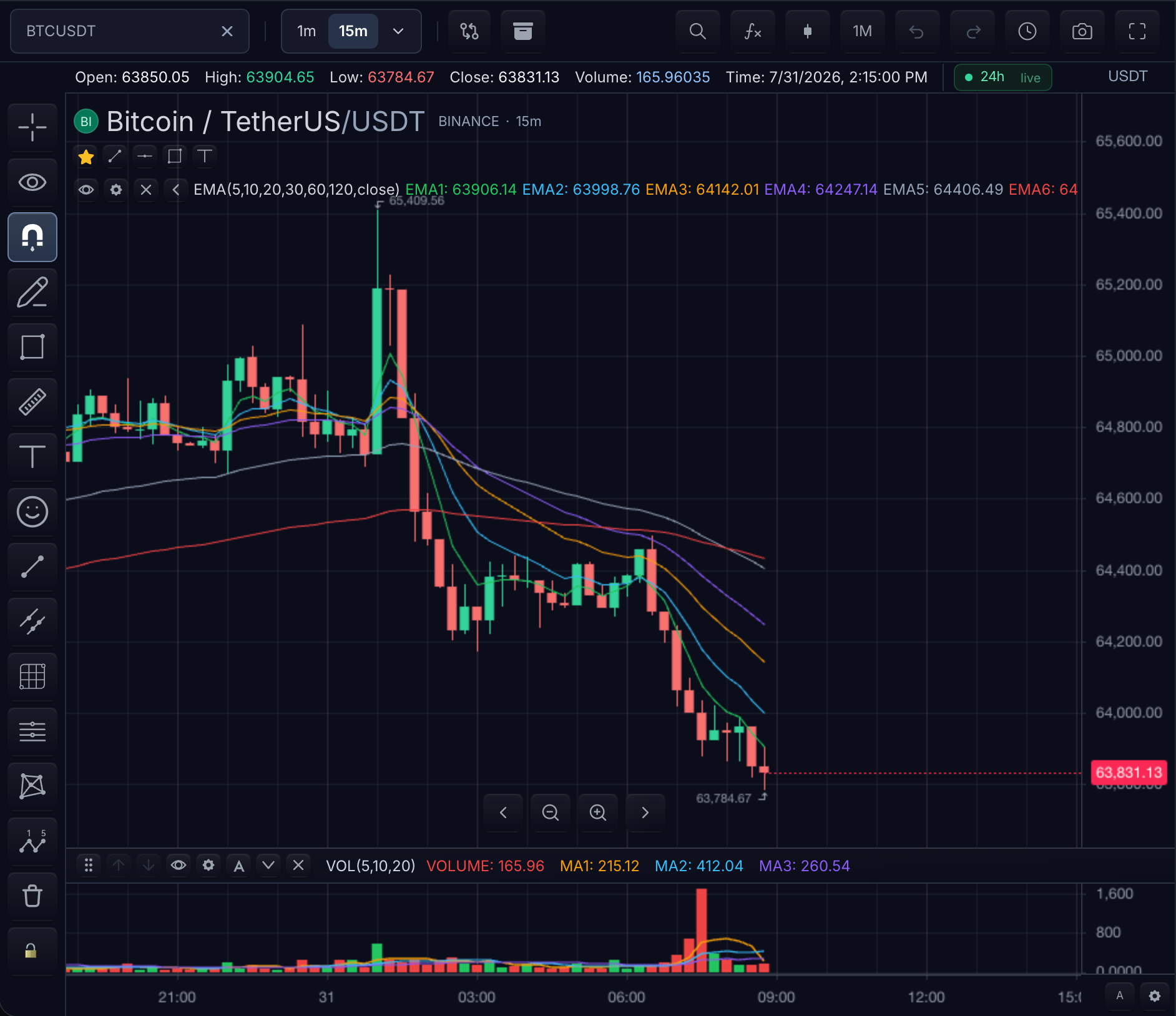
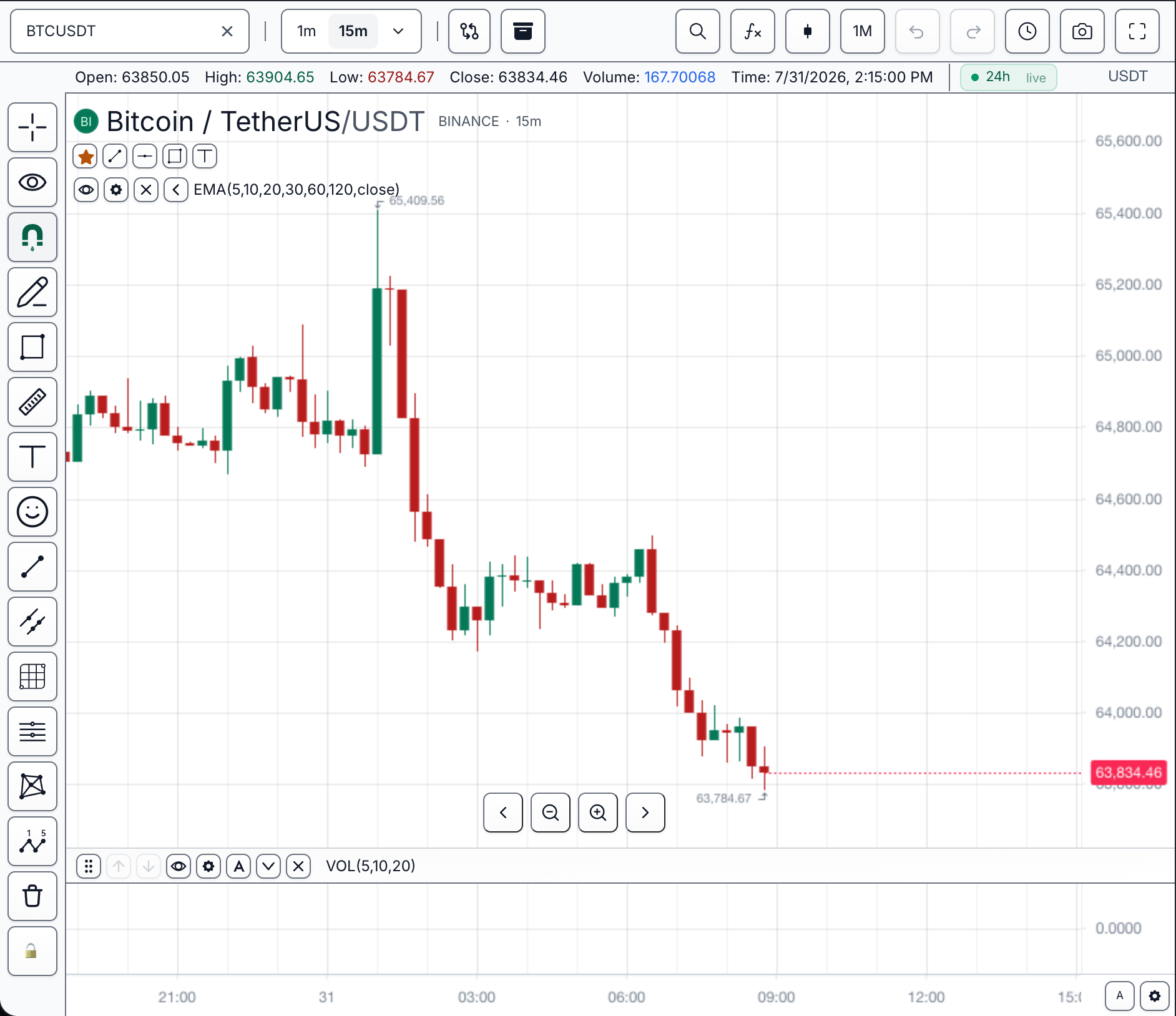
Choose a preset
| If you need… | Start with |
|---|---|
| Default trading terminal | dark |
| Bright application surface | light |
| Low-color institutional UI | modern-monochrome or minimalist-neutrals |
| Brand-forward dark surface | ocean-depths, retro-sunset, vibrant-tropics, or electric-neon |
| Warm or soft light surface | earth-tones, pastel-paradise, soft-scandinavian, or desert-sunset |
sdk.chart.mount({
  mount: '#chart',
  symbol: 'AAPL',
  interval: '1D',
  datafeed,
  theme: 'dark',
});
chart.customization().setTheme('dark');
Minimal custom theme
The shortest custom-theme path is one object with a base. Set base to any preset id and override only what you need — the preset supplies every token you leave out.
chart.customization().setTheme({
  name: 'broker-ocean',
  base: 'ocean-depths',
  ui: {
    semantic: { accent: '#f59e0b' },
  },
});
Visible result: the whole chart adopts the ocean-depths skin, and every accent-colored control turns amber. Nothing else changes.
Crosshair labels
Each scale carries its own crosshair label, and each preset colors them separately. The time-scale label takes a chip derived from that preset's accent — its own color in every one of the twelve. The price-scale label stays neutral, so it reads apart from the direction-colored last-price mark sharing that gutter.
Set either scale from a theme. Naming a scale colors that label's background and its border together; crosshairLabelBackground colors whichever scale is left unnamed.
chart.customization().setTheme({
  name: 'broker-dark',
  base: 'dark',
  colors: {
    crosshairTimeLabelBackground: '#1677ff',
    crosshairPriceLabelBackground: '#e2e8f0',
  },
});
Visible result: the label under the pointer on the time scale turns blue with near-white text, and the price-scale label turns pale with near-black text.
Label text follows its chip. Each label takes whichever of colors.text and colors.background reads on its own background, so recoloring one label flips its text and leaves the other alone. Pin a label's text with crosshairTimeLabelTextColor or crosshairPriceLabelTextColor when a brand color has to win over the readable one.
For a label's font, border width, radius, or padding, use styleOverrides.crosshair — see Background and crosshair. Overrides sit above the theme, so a value set there wins for as long as it is applied.
Shipped Presets
Twelve first-party presets ship with the SDK. Any id can be passed wherever a theme
is accepted, applied at runtime, or used as a base layer to build on. None requires
prior registration.
Dark-ground presets
| Preset id | Character |
|---|---|
dark | The default. Near-black panels, cool neutral text. |
ocean-depths | Deep teal panels with a bright cyan accent. |
retro-sunset | Warm brown panels with an amber accent. |
vibrant-tropics | Deep jungle green with a cyan accent and lime gains. |
modern-monochrome | Greyscale throughout. See the note below. |
electric-neon | Near-black violet with saturated cyan, lime and magenta. |
Light-ground presets
| Preset id | Character |
|---|---|
light | Paper-white panels with high-contrast slate text. |
earth-tones | Warm parchment and clay with an olive accent. |
pastel-paradise | Soft blush panels with a violet accent. |
minimalist-neutrals | Achromatic greys, no colour beyond direction. |
soft-scandinavian | Warm off-white panels with a muted sage accent. |
desert-sunset | Sand panels with a terracotta accent. |
chart.customization().applyTheme('ocean-depths');
Every preset passes the built-in contrast audit at 4.5:1 for text and 3:1 for
non-text chrome. Verify any theme, including your own, with
auditChartThemeContrast.
Inspect the catalog at runtime:
import {
  CHART_THEME_PRESETS,
  CHART_THEME_PRESET_NAMES,
  getChartThemePreset,
  isChartThemeName,
} from '@tradescript/pro/sdk';

CHART_THEME_PRESET_NAMES; // ['dark', 'light', 'earth-tones', ...]
getChartThemePreset('retro-sunset')?.label; // 'Retro Sunset'
isChartThemeName('earth-tones'); // true — exact catalog membership
isChartThemeName('earth'); // false — never inferred from a name pattern
applyTheme throws an SdkError with code theme.not-found for an unknown id, and
its details.available lists every id that would have worked — shipped presets plus
anything you registered.
Registering a theme under a preset's own name overrides that preset for your chart.
modern-monochrome is greyscale by design, so gains and losses are not
distinguishable by hue. Pair it with a non-colour cue — an arrow, a sign, or a label —
wherever your UI shows direction. This applies to any low-chroma theme, including
your own.
A theme never changes order behavior, market-data behavior, permissions, or agent authority. Anything that would change what an action does belongs in overrides or features, not in a theme.
Runtime theme switching and persistence
Runtime theme changes are synchronous SDK calls:
const ui = chart.customization();

ui.setTheme('light');
ui.setTheme(brokerDarkTheme);

const activeTheme = ui.getTheme();
The chart also emits a customization-change event whose customization payload has type theme-change.
Do runtime theme changes persist? The applied theme is stored as CustomizationState.theme, and customization state is included in chart state and layouts:
- Within the session, the change persists until a later
setTheme/applyThemecall or a restored state changes the theme. chart.getState()and saved layouts capture the active theme, so restoring that state or layout restores that theme — including across page reloads, when the host saves and reapplies state through a storage adapter.- Nothing is written to browser storage automatically. Without a host-side save, a page reload starts again from the constructor
themeoption.
If a restored layout brings back a theme you no longer want, reapply the product theme after applyLayout(...) — see My restored layout uses the old theme.
Full theme object
Complete theme object: colors, UI token groups, variables, and scoped CSS
const brokerDarkTheme = {
  base: 'dark',
  name: 'broker-dark',
  colors: {
    background: '#071018',
    grid: '#1f2937',
    text: '#dbeafe',
    up: '#16a34a',
    down: '#dc2626',
  },
  variables: {
    '--ts-chart-button-text': '#dbeafe',
    '--ts-chart-marker-bg': '#f59e0b',
  },
  scopedVariables: {
    '--ts-brand-accent': '#38bdf8',
    '--ts-radius-control': '6px',
  },
  ui: {
    button: {
      background: '#071018',
      selectedBackground: 'rgba(16, 185, 129, 0.2)',
      selectedText: '#6ee7b7',
    },
    control: {
      background: '#050b12',
      focusBorder: '#38bdf8',
    },
    surface: {
      text: '#dbeafe',
      mutedText: '#94a3b8',
      divider: 'rgba(148, 163, 184, 0.22)',
    },
    marker: {
      background: '#f59e0b',
      text: '#020617',
    },
    loader: {
      color: '#38bdf8',
    },
  },
  css: {
    scoped: `
      :host .broker-emphasis {
        color: var(--ts-brand-accent);
      }
    `,
  },
  fontFamily: 'Inter, system-ui, sans-serif',
};

chart.customization().setTheme(brokerDarkTheme);
export interface ChartTheme {
  base?: ChartThemeName;
  name?: string;
  colors?: Record<string, string>;
  variables?: Record<string, string | number>;
  scopedVariables?: Record<`--${string}`, string | number>;
  ui?: ChartUiTheme;
  css?: string | ChartCustomCssTheme;
  fontFamily?: string;
  metadata?: Record<string, unknown>;
}
What applies where
| Field | Applies to |
|---|---|
colors.background | Chart background. |
colors.grid | Chart grid. |
colors.text | Tooltip and shared chart-text defaults. |
colors.up / colors.down | Semantic theme colors for host and widget styling. Use setCandleColors(...) for explicit candle colors. |
colors.crosshairColor | Both crosshair guide lines. |
colors.crosshairLabelBackground | Crosshair axis-label background on whichever axis is not colored on its own. |
colors.crosshairTimeLabelBackground | Time-axis crosshair label, background and border. |
colors.crosshairPriceLabelBackground | Price-axis crosshair label, background and border. |
colors.crosshairTimeLabelTextColor / colors.crosshairPriceLabelTextColor | Crosshair label text, pinned over the readable color each label would otherwise take. |
base | Built-in light or dark token layer applied before this theme object. |
variables | Stable TradeScript UI-token overrides on the chart theme scope. |
scopedVariables | Host-defined custom properties on the chart theme scope. |
ui.button | SDK buttons and toolbar-style controls. |
ui.control | Inputs, selects, and other form controls. |
ui.surface | Panels, menus, and standalone widget surfaces. |
ui.modal | SDK modal surfaces. |
ui.checkbox / ui.radio | Binary and option controls. |
ui.marker | Default datafeed marker colors when a mark does not provide explicit colors. |
ui.loader | Shared loading spinner color and track tokens. |
css.scoped | CSS scoped to one chart instance. |
css.global | Explicit global CSS such as @font-face or shared keyframes. |
fontFamily | Chart and widget font family. |
Scoped CSS
TradeScript is not iframe-isolated. That makes integration easier, but theme CSS must be scoped deliberately.
chart.customization().setTheme({
  name: 'desk',
  css: {
    scoped: `
      :host .ts-chart-control {
        min-height: 32px;
      }
    `,
    global: `
      @font-face {
        font-family: "Desk Sans";
        src: url("/fonts/desk-sans.woff2") format("woff2");
      }
    `,
  },
});
Use scoped for chart-instance styling. Use global only when the CSS is intentionally shared outside the chart.
Named theme registry
Use the native theme registry when a product has more than one named skin or needs to switch between branded themes without re-sending the full object each time.
const ui = chart.customization();

ui.setThemeRegistry({
  deskDark: brokerDarkTheme,
  deskLight: {
    base: 'light',
    name: 'desk-light',
    colors: { background: '#ffffff', text: '#0f172a' },
  },
});

ui.registerTheme('overnight', {
  base: 'dark',
  name: 'overnight',
  colors: { background: '#020617', text: '#e5e7eb' },
});

ui.applyTheme('overnight');
const themes = ui.getThemeRegistry();
ui.unregisterTheme('deskLight');
Registry writes emit theme-registry-change. applyTheme(name) resolves a registered theme first and falls back to built-in light / dark names.
Standalone widgets
Standalone broker widgets can use the same ChartTheme UI tokens as the chart.
For example, BrokerOrderTicket accepts theme, className, and style props,
so an order ticket rendered beside TradeScriptWidget can share the same button,
control, and surface tokens without being mounted inside the chart.
Use theme for the base widget skin. Use widget slot props such as
slotClassNames and slotStyles when individual controls need product-specific
styling, such as different entry, exit, long, short, quantity, or submit buttons.
Related pages
- CSS Variables — the token groups a theme sets, listed by visual target.
- Chrome Slots — attaching your own classes to the chart's furniture.
- Customization Precedence — what happens when a saved layout carries a different theme.
- Accessibility — the contrast requirements a custom theme has to meet.