Overrides
Use typed overrides to change chart presentation without replacing chart components.
applyOverrides(ChartOverrideSettings)changes chart-level groups.applyStyleOverrides(StyleOverrideSettings)changes shared visual groups.
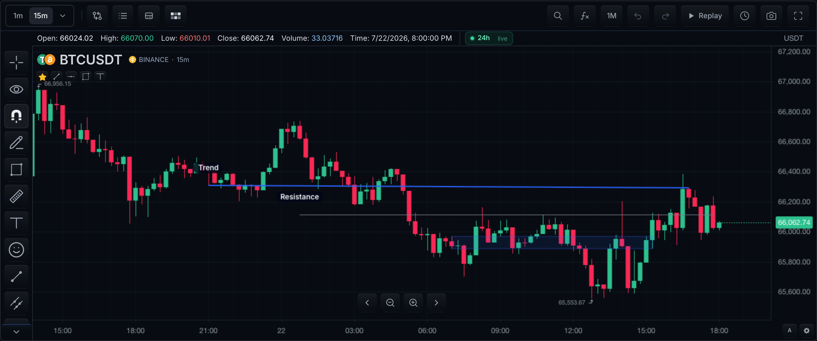
Choose an override group
| Visible change | Group | Verification |
|---|---|---|
| Candle body/wick colors | styleOverrides.candles or setCandleColors | Up/down candles change; semantic buttons do not |
| Grid/axis/pane surface | chartOverrides.grid, axes, panes, scales | Geometry and labels remain readable |
| Drawing/handle appearance | styleOverrides.drawings, handles, text | Selected and unselected states remain distinct |
| Indicator defaults | styleOverrides.indicators | New indicator adopts defaults; explicit saved styles still win |
| Order/position/execution visuals | chartOverrides.trading | Broker meaning is unchanged; only presentation changes |
Every override enters one of two precedence layers: runtime calls (highest source layer) or initialState.customization (restored-state layer, below runtime calls and restored layouts). Within the visual result, chartOverrides and styleOverrides both sit above the theme, so any value you set explicitly survives a theme switch. See Customization Precedence.
Runtime Overrides
Precedence layer: runtime call — the highest source layer; it wins over the constructor, restored state, and the theme for these fields until a later runtime call or restore changes them.
const ui = chart.customization();

ui.applyOverrides({
  grid: {
    horizontal: { color: '#1f2937' },
    vertical: { color: '#1f2937' },
  },
  axes: { labelColor: '#94a3b8' },
});

ui.applyStyleOverrides({
  handles: { color: '#1677FF' },
  candles: { bar: { upColor: '#16a34a', downColor: '#dc2626' } },
});
Visible result: both grid directions immediately darken to slate, axis labels turn muted grey, selection handles on drawings turn blue, and candles repaint green-up/red-down. Nothing else on the chart changes.
Constructor Overrides
Precedence layer: initialState.customization — restored state applied at creation; it beats constructor options such as theme for the same fields, and a later runtime call beats it.
Set initialState.customization when the chart should start with saved or application-defined overrides:
sdk.chart.mount({
  mount: '#chart',
  symbol: 'AAPL',
  interval: '1D',
  datafeed,
  initialState: {
    customization: {
      chartOverrides: {
        mainSeries: { upColor: '#16a34a', downColor: '#dc2626' },
        grid: { horizontal: { color: '#1f2937' } },
      },
      styleOverrides: {
        background: {
          type: 'radial-gradient',
          gradientStartColor: '#0f172a',
          gradientEndColor: '#020617',
        },
        handles: { color: '#1677FF' },
      },
    },
  },
});
Visible result: the chart first paints with green/red candles, a slate horizontal grid, a radial navy-to-black background, and blue drawing handles — no default-then-restyle flash.
Chart Overrides
applyOverrides(ChartOverrideSettings) targets chart-level groups. All of these are the chartOverrides bucket of customization state, so they follow the runtime or constructor layer of whichever call set them.
| Group | Supported behavior |
|---|---|
mainSeries | Chart-type-aware main-series defaults |
grid | Horizontal and vertical grid styling |
axes | Shared time-axis and price-axis styling |
sessions | Session backgrounds and break lines |
chart | Chart container and background styling |
panes | Pane surfaces and separators |
scales | Shared, time-axis, and price-axis settings |
trading | Order, position, execution, and action presentation |
metadata | Application data stored with customization state |
Session Backgrounds
chartOverrides.sessions styles intraday session shading and break lines from the native session calendar. Built-in session buckets and custom calendar state ids support separate color and opacity fields.
ui.applyOverrides({
  sessions: {
    premarket: { color: '#1e293b', opacity: 0.14 },
    regular: { color: '#020617', opacity: 0.05 },
    afterhours: { color: '#111827', opacity: 0.12 },
    stateColors: {
      'opening-auction': { color: '#f59e0b', opacity: 0.18 },
      halted: { color: '#ef4444', opacity: 0.22 },
    },
    breakLines: { show: true, color: '#64748b', size: 1 },
  },
});
Visible result: pre-market columns tint dark slate, after-hours columns tint near-black, halted periods glow red at 22% opacity, and thin grey break lines appear at session boundaries. (Runtime layer when called as shown.)
Trading presentation
chartOverrides.trading supports order, position, execution, confirmation, action, P&L, bracket, and protection presentation. Broker capabilities still determine whether cancel, close, protect, and reverse actions are available.
| Bucket | Applies to |
|---|---|
orders | Broker-backed order lines |
positions | Broker-backed position lines |
draft | The pre-trade on-chart order draft: entry line, exit legs, price tags, ticket capsule, exit rows |
executions | Execution markers and their labels |
display | Visibility and behavior of each overlay group |
Trading visual visibility
chartOverrides.trading.display carries one switch per trading visual group. Every renderer that draws a trading visual resolves its visibility from these four keys: the canvas position and execution overlays, the live-order HTML layer, and the order-draft layer. Switching a group off therefore removes it from the chart entirely, not from one renderer.
| Key | Hides | Default |
|---|---|---|
positionsVisible | Broker position lines | true |
ordersVisible | Broker order rows | true |
executionsVisible | Execution marks | true |
draftsVisible | The pre-trade order draft: entry capsule, exit rows, lines, price tags | follows ordersVisible |
draftsVisible is unset by default and follows ordersVisible, because a draft is an order being composed — hiding orders hides the draft with them. Set it explicitly to break that link in either direction.
chart.customization().applyOverrides({
  trading: { display: { executionsVisible: false, draftsVisible: true, ordersVisible: false } },
});
Visible result: execution marks and live order rows disappear from the chart while position lines stay, and a draft the user is composing survives the order blackout because it was pinned on. (Runtime layer.)
The drawing toolbar's Visibility Options menu writes the same keys: it carries one entry each for positions, orders, and execution marks, a combined entry that moves all three, and Hide all which also covers drawings and indicators. Each entry reads its own current state, so a group already hidden offers Show.
Order draft styling
chartOverrides.trading.draft takes the same TradingLineStylePatch vocabulary as orders and positions, so the draft a user drags from the price axis can match the broker lines it turns into. Fields resolve base patch first, then kindStyles for the line kind, then sideStyles once a side is picked, then movingStyle while a line is being dragged.
chart.customization().applyOverrides({
  trading: {
    draft: {
      lineWidth: 2,
      bodyBackgroundColor: '#0b1220',
      kindStyles: {
        entry: { color: '#4f7cff', lineStyle: 2 },
        takeProfit: { color: '#2dd4bf', bodyTextColor: '#5eead4', pnlPositiveTextColor: '#86efac' },
        stopLoss: { stopColor: '#fbbf24', bodyTextColor: '#fcd34d' },
      },
      sideStyles: {
        buy: { buyColor: '#10b981' },
        sell: { sellColor: '#ef4444' },
      },
      movingStyle: { bodyBorderColor: '#94a3b8' },
    },
  },
});
Visible result (runtime layer):
- The draft entry line renders blue and dashed at 2px.
- Take-profit legs render teal, with mint text and light-green positive P&L.
- Stop legs render amber.
- The side tint flips green or red once buy or sell is chosen.
- A dragged line's capsule border lightens to grey.
kindStyles keys are entry, takeProfit, and stopLoss. sideStyles keys are buy and sell. lineStyle is 0 solid, 1 dotted, anything else dashed; the defaults are a dashed entry line and dotted exit lines.
Field groups map onto the draft chrome as follows.
| Fields | Applies to |
|---|---|
color, buyColor, sellColor, stopColor | Line tone, price tag fill, and every tint derived from it |
lineStyle, lineWidth | Line render style and thickness |
labelTextColor, labelBackgroundColor, labelFontSize, labelFontWeight, labelFontFamily | Price tag on the axis |
bodyBackgroundColor, bodyBorderColor, bodyBorderWidth, bodyTextColor, bodyDividerColor, bodyFont, bodyFontSize, bodyFontWeight | Ticket capsule and exit rows |
quantityTextColor, quantityBackgroundColor | Quantity inputs on the ticket capsule and exit rows |
pnlTextColor, pnlPositiveTextColor, pnlNegativeTextColor, pnlNeutralTextColor, pnlBackgroundColor, pnlFont, pnlFontSize, pnlFontWeight | P&L segment on an exit row |
gripBackgroundColor, anchorPointColor | Drag grip on an exit row |
cancelButtonIconColor, cancelButtonBackgroundColor | Close-draft button on the capsule and remove-leg buttons on exit rows |
movingStyle | Any of the above while that line is dragged |
Fields the draft does not render are accepted and stored, but have no effect. Every field falls back to the built-in design, so an empty draft bucket renders exactly as before.
Trading row geometry
Every on-chart trading row — a broker order row, a draft entry capsule, a draft take-profit or stop-loss row — renders through one shared base: a price line spanning the plot, an invisible drag strip over it, a drag grip, and a capsule of segments. The geometry of that base is not hardcoded in a layer. It resolves from the same TradingLineStylePatch you already use for color, so the dial you set on orders moves every order row, the dial you set on draft.kindStyles.stopLoss moves every stop-loss row, and nothing else shifts.
| Field | Drives |
|---|---|
rowHeight | Outer height of the row capsule in pixels, its own border included. Every row in a bucket lands on exactly this number in any host page, whatever box-sizing its CSS reset applies; segments fill what the border leaves |
rowRadius | Corner radius of the row capsule |
rowInset | Gap between the plot edge the row anchors to and the capsule |
rowSegmentPaddingX | Horizontal padding inside each segment |
rowDividerHeight, labelDividerWidth, bodyDividerColor | The hairline between two segments |
rowLineHitHeight | Height of the invisible strip that catches a drag on the line |
gripVisible, gripSize, gripOpacity, gripPaddingX, gripBackgroundColor | The six-dot drag grip that leads a draggable row |
gripCursor, gripDraggingCursor | Cursor over the grip. Any CSS cursor value; defaults to grab, and grabbing while the line is being dragged |
lineGlowColor, lineGlowRadius | Halo painted around the line while its row is active or dragging |
lineStyle, lineWidth | Line render (0 solid, 1 dotted, anything else dashed) and thickness |
labelHorizontalAlignment | Anchors the capsule left, center, or right along its line |
labelOffsetX, labelSlidable | Starting offset from that anchor in pixels (negative slides left), and whether the user may drag the row along its line |
labelRadius, labelPaddingX, labelPaddingY, labelMinWidth | The price tag the row parks on the price axis |
quantityWidth, quantityWarningColor | The quantity field, and the tone it takes when the SDK flags the value (draft exit legs adding up past the entry quantity) |
pnlMinWidth | Floor under the P&L segment, so stacked rows keep their columns aligned |
actionIconSize, actionButtonWidth | Every row action button: cancel, remove leg, close draft, confirm, dismiss |
sideCapPaddingX | Horizontal padding inside the draft ticket's buy/sell caps |
Each text segment of a row can also be dropped without touching the rest.
| Field | Hides |
|---|---|
typeVisible | The order-type and side segment (Limit SELL) |
quantityVisible | The quantity segment |
priceVisible | The price segment (@ $63,501.71) |
pnlVisible | The P&L segment |
hintVisible | The role hint segment (Take profit, Stop loss, Bracket) |
statusBadgeVisible | The status segment (Working, Partial, Warning) |
chart.customization().applyOverrides({
  trading: {
    orders: {
      rowHeight: 24,
      rowRadius: 3,
      rowInset: 12,
      rowSegmentPaddingX: 6,
      gripBackgroundColor: '#1e293b',
      lineGlowColor: '#38bdf8',
      typeVisible: false,
      statusBadgeVisible: false,
    },
  },
});
Visible result (runtime layer):
- Broker order rows render as compact 24px capsules with barely-rounded corners, sitting 12px off the price axis.
- The drag grip gets a slate chip behind it.
- A dragged line glows sky-blue.
- The
Limit SELLandWorkingsegments disappear, so the row reads only quantity, price, and cancel.
gripVisible: false removes the visible grip but does not lock the row: the line itself stays draggable through its full-width strip wherever the broker supports modification. A row the broker cannot re-price never renders a grip regardless of this setting.
Moving a row
The grip drags on both axes. Vertical travel re-prices the line; horizontal travel slides the capsule along it, which is how a user moves a row off candles sitting underneath it. The line always spans the full plot, so sliding never detaches the capsule from its price.
The row travels with the pointer from wherever it was grabbed rather than jumping to it, so a sideways drag leaves the price untouched. Travel is clamped to keep at least 60px of the row inside the plot: a right-anchored row can only move left, a left-anchored row only right, and a centred row either way.
Set labelOffsetX to place a row away from its anchor from the start, and labelSlidable: false to pin it there — the declared offset still applies, the user just cannot change it.
Editing row style from chart settings
The chart's own settings panel carries the same dials, for users who should be able to repaint rows without host code.
Under Settings → Trading, the Row style block picks a bucket — order rows, position lines, or one of the three draft rows. For the selected bucket it edits line, row fill, row border, row text, price tag, and price tag text colors, plus text size, border width, row radius, price tag radius, and row height.
Draft buckets write into draft.kindStyles.<kind>; every other bucket writes into its own. A panel edit and an applyOverrides call therefore land in exactly the same place. Empty fields show the built-in default as a placeholder and stay unset.
Hide the whole card with settingsSections={{ trading: false }} when the host owns trading presentation.
Style Overrides
applyStyleOverrides(StyleOverrideSettings) targets shared visual groups. Like chart overrides, they carry the layer of the call that set them, and they sit above the theme in the visual composition.
| Group | Supported behavior |
|---|---|
styles | Advanced direct style records for supported chart fields |
background | Solid, gradient, CSS, or registered WebGL shader chart backgrounds |
crosshair | Horizontal/vertical lines and axis labels |
indicators | Shared indicator presentation |
drawings | Shared point, line, shape, arc, and text presentation |
handles | Selection and control-point handles |
candles | Main-series candle, area, bar, baseline, and point presentation |
grid, separator, text, colors | Shared chart primitives |
averageClosePriceLine, bidAskPriceLine, highLowPriceLine, previousClosePriceLine | Reference-line presentation when the matching display setting is enabled |
toolbar, modals, metadata | Stored customization values; live toolbar/modal appearance uses ChartTheme.ui |
Background and crosshair
styleOverrides.background supports solid, vertical-gradient, horizontal-gradient, diagonal-gradient, radial-gradient, css, and shader. Crosshair line styles support visibility, color, width, dash, opacity, cap, and join. Crosshair labels support text, background, border, radius, and padding.
Each arm carries the label on the scale it meets: horizontal is the price-scale label, vertical is the time-scale label. Style them independently.
ui.applyStyleOverrides({
  background: {
    type: 'diagonal-gradient',
    gradientStartColor: '#0f172a',
    gradientEndColor: '#111827',
    gradientAngle: 132,
  },
  crosshair: {
    horizontal: {
      line: { color: '#f8fafc', size: 2, style: 'dashed', opacity: 0.64 },
      text: { color: '#020617', backgroundColor: '#e2e8f0' },
    },
    vertical: {
      text: { color: '#f8fafc', backgroundColor: '#1677ff', borderColor: '#1677ff' },
    },
  },
});
Visible result: the canvas background becomes a navy gradient angled at 132 degrees, and the horizontal crosshair line turns into a 2px dashed near-white line at 64% opacity with a light label chip on the price axis. The time-axis label under the pointer becomes a blue chip with near-white text. (Runtime layer.)
For palette-level control that a preset can carry, color the two labels from the theme instead — see Crosshair labels.
WebGL shader backgrounds
Register shader source on the widget, then store only its id and uniforms in customization state. The shader spans the full chart widget shell behind the top toolbar, OHLC row, drawing rail, labels, and chart canvases, while controls and chart content remain fully interactive above it.
Shader registration and customization-state reference
sdk.chart.mount({
  mount: '#chart',
  symbol: 'AAPL',
  interval: '1D',
  datafeed,
  backgroundShaders: {
    'brand-sheen': {
      fragmentShader: `#version 300 es
precision highp float;
in vec2 vUv;
uniform float uTime;
uniform float uIntensity;
out vec4 fragColor;
void main() {
  float sheen = 0.5 + 0.5 * sin((vUv.x + vUv.y) * 8.0 + uTime);
  fragColor = vec4(vec3(0.02, 0.08, 0.14) + sheen * uIntensity, 1.0);
}`,
      animated: true,
      maxFps: 24,
      resolutionScale: 0.5,
      uniforms: { uIntensity: 0.08 },
      onError: ({ phase, message }) => console.warn(phase, message),
    },
  },
  initialState: {
    customization: {
      styleOverrides: {
        background: {
          type: 'shader',
          color: '#050d16',
          shaderId: 'brand-sheen',
          shaderUniforms: { uIntensity: 0.1 },
        },
      },
    },
  },
});
Visible result: a slow diagonal sheen animates across the whole widget shell behind every control. (Constructor layer via initialState.customization; the shader registration itself is a widget option, not customization state.)
Shaders are static by default. Animated shaders are hard-capped at 30 FPS, 0.75 resolution scale, and a 1080p backing buffer; they are initialized during idle time and pause while the chart is being manipulated, while the page is hidden, or when reduced motion is requested. The color field is the fallback when the registered shader cannot run. Runtime-owned uniforms are uResolution, uTime, and uDpr; custom uniforms support finite floats and float vectors of length one through four and cannot replace those built-ins.
Indicator Overrides
Use setBuiltInIndicatorDefaults(...) for future instances of one built-in indicator. Existing indicators keep their values until updated explicitly through native mutation APIs such as updateBuiltInIndicatorProperties(...).
ui.setBuiltInIndicatorDefaults('EMA', {
  inputs: { length: 21 },
  styles: { line: { color: '#38bdf8' } },
});
Visible result: nothing changes immediately — the next EMA a user adds arrives with length 21 and a cyan line, while EMAs already on the chart are untouched. (Runtime layer; stored as indicatorDefaults in customization state.)
Use the Built-in Indicator Reference for supported inputs and styles, inspectBuiltInIndicatorDefaults(...) for future-default diagnostics, and inspectBuiltInIndicatorProperties(...) for existing built-in property-patch diagnostics.
Indicator values on the price axis
indicator.lastValueMark is the chart-wide switch for indicator plot values rendered as price-axis labels. Both fields must agree — the renderer draws the tag from show and its text from text.show:
chart.setStyles({ indicator: { lastValueMark: { show: true, text: { show: true } } } });
Visible result: every indicator plot gains a value tag on the price axis at its latest value. The built-in settings dialog exposes this as Show indicator values on price axis under Price Axis and writes both fields. Individual indicators override it with axisLabelVisible — see Indicator settings.
Drawing Overrides
Use setDrawingDefaultStyles(toolId, styles) for future drawings of one tool. Existing drawings keep their values until updated explicitly through updateDrawingProperties(...).
ui.setDrawingDefaultStyles('segment', {
  line: { color: '#38bdf8', size: 2, style: 'dashed' },
});
Visible result: nothing changes immediately — the next segment a user draws arrives cyan, 2px, and dashed, while segments already on the chart are untouched. (Runtime layer; stored as drawingDefaultStyles in customization state.)
Use the Drawing Tool Reference for supported per-tool style paths and inspectDrawingNativeStyles(...) to validate them.
Validation and errors
validateCustomizationState(...) returns diagnostics for invalid typed values. inspectDrawingNativeStyles(...) validates a drawing tool's documented style paths. inspectBuiltInIndicatorProperties(...) validates one existing built-in indicator property patch before mutation. Strict drawing and built-in indicator property updates reject unsupported fields before mutation; broad custom object patches remain available for application-defined payloads.
Persistence and precedence
Customization state is included in chart state and layouts. Runtime calls override constructor values until a later state restore or runtime call changes the same field. See Customization Precedence.
Related pages
- Customization Precedence — the full layer order and three worked conflicts.
- Themes — the base skin overrides compose on top of.
- Customization Troubleshooting — diagnosing an override that is stored but not applied.
- Drawing Tool Reference — the supported style paths per drawing tool.