CSS Variables
TradeScript mounts into the host DOM, not an iframe. Use ordinary host CSS for page-level styling, ChartTheme.variables for stable TradeScript UI tokens, and ChartTheme.scopedVariables for host-defined chart-scoped custom properties.
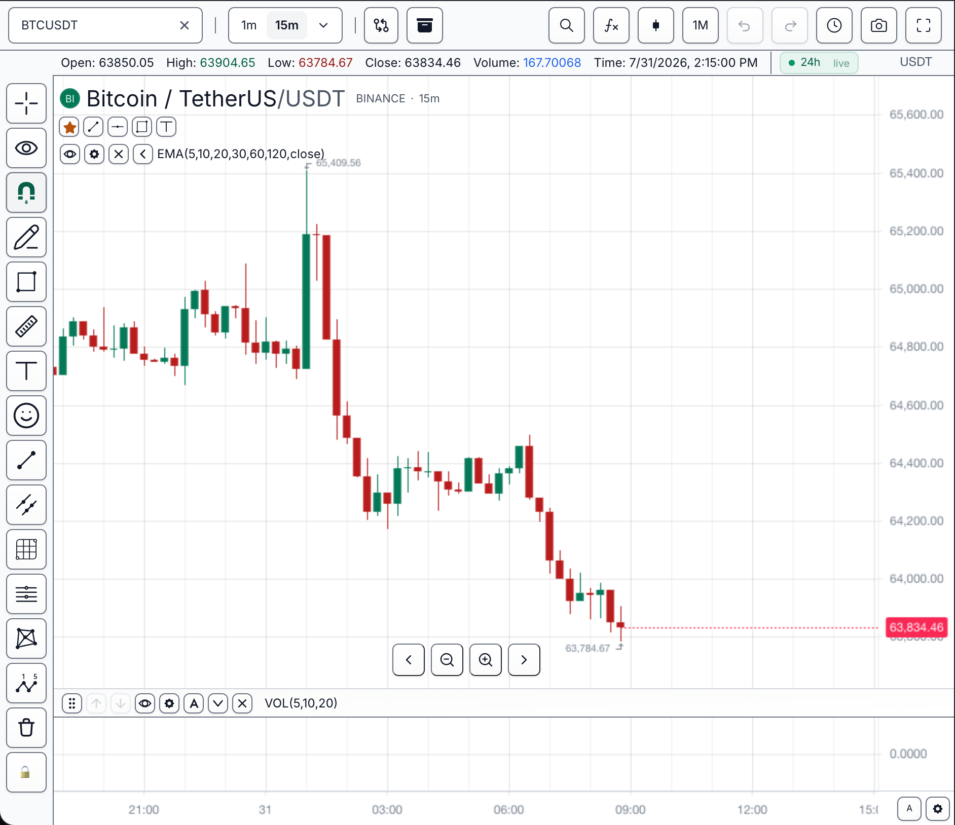
Find a token group by visual target
Prefer the typed ChartTheme.ui groups over writing variables directly. Every group below lands on the chart's own theme scope, so two charts on one page can carry different values.
| You are styling... | Token group | Scope |
|---|---|---|
| Toolbar and chrome buttons | Buttons via ui.button | One chart theme scope |
| Buy/sell/emphasised action buttons | Tonal action buttons via ui.buttonPositive etc. | One chart theme scope |
| Inputs, selects, form controls | Controls via ui.control | Chart plus portaled SDK surfaces |
| Checkboxes and radios | Checkboxes / Radios | Chart plus portaled SDK surfaces |
| Focus rings | Focus via ui.focus | One chart theme scope |
| Panels, menus, and cards | Surfaces via ui.surface | Chart plus portaled SDK surfaces |
| Modal dialogs | Modals via ui.modal | Chart plus portaled SDK surfaces |
| Datafeed marks on the chart | Markers via ui.marker | One chart theme scope |
| Loading spinners | Loaders via ui.loader | One chart theme scope |
| Drawing cursor, favorites sweep, sidebar | Chart chrome via ui.chrome | One chart theme scope |
| Accent, gain/loss, warning colors | Semantic via ui.semantic | Shared semantic UI |
| Level 2 ladder and market depth | Order book via ui.depth | Order-book surfaces |
| Session badge states | Session states via ui.session | Chart session UI |
prefers-contrast: more swaps | High contrast via ui.contrast | One chart theme scope |
| Legend symbol avatars | Identity colours via ui.identity | One chart theme scope |
| Fonts and text sizing | Typography via ui.typography | One chart theme scope |
| Host-only custom variable | scopedVariables | One chart instance |
chart.customization().setTheme({
  name: 'desk-dark',
  scopedVariables: {
    '--ts-brand-accent': '#38bdf8',
    '--ts-danger': '#dc2626',
    '--ts-control-height': '32px',
  },
});
Chart-instance scope versus global scope
Every --ts-chart-* token is chart-instance scoped: the SDK writes it onto the chart's own theme scope element, not onto :root, and re-declares it on portaled dropdowns, menus, and modals so detached UI stays themed. CSS you supply chooses its scope explicitly.
Use ChartTheme.css.scoped when a rule should apply only to one chart instance:
chart.customization().setTheme({
  name: 'desk-dark',
  css: {
    scoped: `
      :host .ts-chart-control {
        min-height: var(--ts-control-height);
      }
    `,
  },
});
Use ChartTheme.css.global only for shared rules that intentionally escape the chart instance:
chart.customization().setTheme({
  name: 'desk-dark',
  css: {
    global: `
      @font-face {
        font-family: "Desk Sans";
        src: url("/fonts/desk-sans.woff2") format("woff2");
      }
    `,
  },
});
Built-In UI Tokens
The SDK maps ChartTheme.ui onto stable CSS variables for common controls. Prefer the typed ui object over writing these variables directly. Hosts that compose chart-adjacent UI can import CHART_THEME_UI_CSS_VARIABLES from @tradescript/pro/sdk to validate or copy the supported token list.
The tables are grouped by visual target: controls and buttons, surfaces, modals, and chrome, meaning and status, and identity and typography.
Controls and buttons
Buttons
| Theme field | CSS variable |
|---|---|
ui.button.background | --ts-chart-button-bg |
ui.button.border | --ts-chart-button-border |
ui.button.text | --ts-chart-button-text |
ui.button.icon | --ts-chart-button-icon |
ui.button.hoverBackground | --ts-chart-button-hover-bg |
ui.button.hoverBorder | --ts-chart-button-hover-border |
ui.button.hoverText | --ts-chart-button-hover-text |
ui.button.hoverIcon | --ts-chart-button-hover-icon |
ui.button.selectedBackground | --ts-chart-button-selected-bg |
ui.button.selectedBorder | --ts-chart-button-selected-border |
ui.button.selectedText | --ts-chart-button-selected-text |
ui.button.selectedIcon | --ts-chart-button-selected-icon |
ui.button.selectedOverlay | --ts-chart-button-selected-overlay |
ui.button.selectedShadow | --ts-chart-button-selected-shadow |
ui.button.selectedShine | --ts-chart-button-selected-shine |
ui.button.overlay | --ts-chart-button-overlay |
ui.button.shadow | --ts-chart-button-shadow |
ui.button.disabledBackground | --ts-chart-button-disabled-bg |
ui.button.disabledBorder | --ts-chart-button-disabled-border |
ui.button.disabledText | --ts-chart-button-disabled-text |
ui.button.disabledIcon | --ts-chart-button-disabled-icon |
Tonal action buttons
StandardButton's tone prop — the buy, sell and emphasised actions in order
tickets, ladders and account panels. Each tone has the same six fields, so the table
below lists one; substitute positive, negative or highlight.
These are visual only. positive and negative name the direction a control
represents; they never decide which side an order takes.
| Theme field | CSS variable |
|---|---|
ui.buttonPositive.background | --ts-chart-button-positive-bg |
ui.buttonPositive.border | --ts-chart-button-positive-border |
ui.buttonPositive.text | --ts-chart-button-positive-text |
ui.buttonPositive.hoverBackground | --ts-chart-button-positive-hover-bg |
ui.buttonPositive.hoverBorder | --ts-chart-button-positive-hover-border |
ui.buttonPositive.hoverText | --ts-chart-button-positive-hover-text |
ui.buttonNegative.* | --ts-chart-button-negative-* |
ui.buttonHighlight.* | --ts-chart-button-highlight-* |
Controls
| Theme field | CSS variable |
|---|---|
ui.control.background | --ts-chart-control-bg |
ui.control.border | --ts-chart-control-border |
ui.control.text | --ts-chart-control-text |
ui.control.placeholderText | --ts-chart-control-placeholder-text |
ui.control.hoverBackground | --ts-chart-control-hover-bg |
ui.control.hoverBorder | --ts-chart-control-hover-border |
ui.control.focusBorder | --ts-chart-control-focus-border |
ui.control.disabledBackground | --ts-chart-control-disabled-bg |
ui.control.disabledBorder | --ts-chart-control-disabled-border |
ui.control.disabledText | --ts-chart-control-disabled-text |
ui.control.radius | --ts-chart-control-radius |
ui.control.pillRadius | --ts-chart-control-pill-radius |
Checkboxes
| Theme field | CSS variable |
|---|---|
ui.checkbox.background | --ts-chart-checkbox-bg |
ui.checkbox.border | --ts-chart-checkbox-border |
ui.checkbox.hoverBorder | --ts-chart-checkbox-hover-border |
ui.checkbox.checkedBackground | --ts-chart-checkbox-checked-bg |
ui.checkbox.checkedBorder | --ts-chart-checkbox-checked-border |
ui.checkbox.checkColor | --ts-chart-checkbox-check |
ui.checkbox.checkedOverlay | --ts-chart-checkbox-checked-overlay |
ui.checkbox.disabledBackground | --ts-chart-checkbox-disabled-bg |
ui.checkbox.disabledBorder | --ts-chart-checkbox-disabled-border |
ui.checkbox.disabledCheckColor | --ts-chart-checkbox-disabled-check |
Radios
| Theme field | CSS variable |
|---|---|
ui.radio.background | --ts-chart-radio-bg |
ui.radio.border | --ts-chart-radio-border |
ui.radio.hoverBorder | --ts-chart-radio-hover-border |
ui.radio.checkedBackground | --ts-chart-radio-checked-bg |
ui.radio.checkedBorder | --ts-chart-radio-checked-border |
ui.radio.dotColor | --ts-chart-radio-dot |
ui.radio.disabledBackground | --ts-chart-radio-disabled-bg |
ui.radio.disabledBorder | --ts-chart-radio-disabled-border |
Focus
| Theme field | CSS variable |
|---|---|
ui.focus.ring | --ts-chart-focus-ring |
ui.focus.inputRing | --ts-chart-input-focus-ring |
Surfaces, modals, and chrome
Surfaces
| Theme field | CSS variable |
|---|---|
ui.surface.background | --ts-chart-surface-bg |
ui.surface.border | --ts-chart-surface-border |
ui.surface.inactiveBorderWidth | --ts-chart-surface-inactive-border-width |
ui.surface.borderRadius | --ts-chart-surface-border-radius |
ui.surface.text | --ts-chart-surface-text |
ui.surface.mutedText | --ts-chart-surface-muted-text |
ui.surface.subtleText | --ts-chart-surface-subtle-text |
ui.surface.headingText | --ts-chart-surface-heading-text |
ui.surface.divider | --ts-chart-surface-divider |
ui.surface.hoverBackground | --ts-chart-surface-hover-bg |
ui.surface.selectedBackground | --ts-chart-surface-selected-bg |
ui.surface.selectedBorder | --ts-chart-surface-selected-border |
ui.surface.selectedText | --ts-chart-surface-selected-text |
ui.surface.activeBorder | --ts-chart-surface-active-border |
ui.surface.focusBorderWidth | --ts-chart-surface-focus-border-width |
ui.surface.shadow | --ts-chart-surface-shadow |
ui.surface.activeBackground | --ts-chart-surface-active-bg |
ui.surface.shellBackground | --ts-chart-shell-bg |
Modals
| Theme field | CSS variable |
|---|---|
ui.modal.backdrop | --ts-chart-modal-backdrop |
ui.modal.background | --ts-chart-modal-bg |
ui.modal.border | --ts-chart-modal-border |
ui.modal.shadow | --ts-chart-modal-shadow |
ui.modal.text | --ts-chart-modal-text |
ui.modal.mutedText | --ts-chart-modal-muted-text |
ui.modal.titleText | --ts-chart-modal-title-text |
ui.modal.headerBackground | --ts-chart-modal-header-bg |
ui.modal.headerBorder | --ts-chart-modal-header-border |
ui.modal.footerBorder | --ts-chart-modal-footer-border |
Markers
| Theme field | CSS variable |
|---|---|
ui.marker.background | --ts-chart-marker-bg |
ui.marker.border | --ts-chart-marker-border |
ui.marker.text | --ts-chart-marker-text |
Loaders
| Theme field | CSS variable |
|---|---|
ui.loader.color | --ts-chart-loader-color |
ui.loader.track | --ts-chart-loader-track |
Chart Chrome
| Theme field | CSS variable |
|---|---|
ui.chrome.drawingCursor | --ts-chart-drawing-cursor |
ui.chrome.favoriteSweep | --ts-chart-favorite-sweep |
ui.chrome.selectionCardSheen | --ts-chart-selection-card-sheen |
ui.chrome.drawingSidebarOverflowBorder | --ts-chart-drawing-sidebar-overflow-border |
ui.chrome.drawingSidebarOverflowBorderWidth | --ts-chart-drawing-sidebar-overflow-border-width |
ui.chrome.drawingSidebarOverflowBackground | --ts-chart-drawing-sidebar-overflow-bg |
ui.chrome.drawingSidebarOverflowHoverBackground | --ts-chart-drawing-sidebar-overflow-hover-bg |
Meaning and status
Semantic
Meaning-carrying colors shared by chart chrome and widgets. These are visual only — changing them never changes which values the SDK treats as a gain or a loss. A theme that signals direction by color alone still needs a non-color cue.
| Theme field | CSS variable |
|---|---|
ui.semantic.accent | --ts-chart-accent |
ui.semantic.positive | --ts-chart-positive |
ui.semantic.negative | --ts-chart-negative |
ui.semantic.warning | --ts-chart-warning |
ui.semantic.positiveBackground | --ts-chart-positive-bg |
ui.semantic.positiveText | --ts-chart-positive-text |
ui.semantic.negativeBackground | --ts-chart-negative-bg |
ui.semantic.negativeBorder | --ts-chart-negative-border |
ui.semantic.negativeText | --ts-chart-negative-text |
ui.semantic.positiveOnText | --ts-chart-positive-on-text |
ui.semantic.negativeOnText | --ts-chart-negative-on-text |
Order book
Colors for the order-book surfaces — the Level 2 ladder and the market-depth panel.
Separate from ui.semantic on purpose. The semantic pair is tuned for a single P&L
figure on a panel, and a book is a grid of hundreds of figures scanned by side and by
shape; the shipped positiveText/negativeText render one loss figure well and a whole
ladder as pastel. Setting bid/ask alone retints the fills, the resting-order marks
and the ladder's buy/sell buttons; set the text values with them if you move the marks
substantially, since the shipped text is computed to clear 4.5:1 on the surface.
The hairlines are the ladder's structure rather than its palette: rowDivider rules
every price level, columnDivider separates the size columns from the price, and
spreadDivider marks the bid/ask boundary. scrollbarThumb is the one piece of chrome
in the group — it rides over the outer size column, so it is set below the rules rather
than with them.
| Theme field | CSS variable |
|---|---|
ui.depth.bid | --ts-chart-depth-bid |
ui.depth.bidText | --ts-chart-depth-bid-text |
ui.depth.bidFill | --ts-chart-depth-bid-fill |
ui.depth.bidOrderBackground | --ts-chart-depth-bid-order-bg |
ui.depth.bidOrderText | --ts-chart-depth-bid-order-text |
ui.depth.ask | --ts-chart-depth-ask |
ui.depth.askText | --ts-chart-depth-ask-text |
ui.depth.askFill | --ts-chart-depth-ask-fill |
ui.depth.askOrderBackground | --ts-chart-depth-ask-order-bg |
ui.depth.askOrderText | --ts-chart-depth-ask-order-text |
ui.depth.priceText | --ts-chart-depth-price-text |
ui.depth.spreadPriceText | --ts-chart-depth-spread-price-text |
ui.depth.headerText | --ts-chart-depth-header-text |
ui.depth.rowDivider | --ts-chart-depth-row-divider |
ui.depth.columnDivider | --ts-chart-depth-column-divider |
ui.depth.rowHoverBackground | --ts-chart-depth-row-hover-bg |
ui.depth.spreadDivider | --ts-chart-depth-spread-divider |
ui.depth.scrollbarThumb | --ts-chart-depth-scrollbar-thumb |
ui.depth.currentBackground | --ts-chart-depth-current-bg |
ui.depth.currentBorder | --ts-chart-depth-current-border |
ui.depth.currentText | --ts-chart-depth-current-text |
ui.depth.upFlash | --ts-chart-depth-up-flash |
ui.depth.downFlash | --ts-chart-depth-down-flash |
chart.customization().setTheme({
  name: 'desk-dark',
  base: 'dark',
  ui: {
    depth: {
      bid: '#2ebd85',
      ask: '#e5484d',
      rowDivider: 'rgba(148, 163, 184, 0.2)',
    },
  },
});
Session states
The session badge colour-codes five trading states. These are deliberately separate
from ui.semantic: pre-market and post-market have to be told apart from each other
and from the accent, which reusing positive/negative/warning would prevent.
Each state carries three values — a mark (the dot, and the seed the border is mixed from), the fill the badge paints behind its label, and the label text. Setting the mark alone retints a state's dot and border; set the fill and text together with it if you change the mark substantially, since the shipped text values are computed to clear 4.5:1 against the shipped fill.
closed and holiday are intentionally absent — they render in the neutral surface
tones (--ts-chart-surface-muted-text and friends) rather than a state hue.
| Theme field | CSS variable |
|---|---|
ui.session.regular | --ts-chart-session-regular |
ui.session.regularBackground | --ts-chart-session-regular-bg |
ui.session.regularText | --ts-chart-session-regular-text |
ui.session.preMarket | --ts-chart-session-pre-market |
ui.session.preMarketBackground | --ts-chart-session-pre-market-bg |
ui.session.preMarketText | --ts-chart-session-pre-market-text |
ui.session.postMarket | --ts-chart-session-post-market |
ui.session.postMarketBackground | --ts-chart-session-post-market-bg |
ui.session.postMarketText | --ts-chart-session-post-market-text |
ui.session.halted | --ts-chart-session-halted |
ui.session.haltedBackground | --ts-chart-session-halted-bg |
ui.session.haltedText | --ts-chart-session-halted-text |
ui.session.custom | --ts-chart-session-custom |
ui.session.customBackground | --ts-chart-session-custom-bg |
ui.session.customText | --ts-chart-session-custom-text |
High Contrast
Swapped in under prefers-contrast: more. A media query cannot read the active
theme, so these are how a preset keeps its own ground when the user asks for more
contrast rather than being forced to one fixed palette.
| Theme field | CSS variable |
|---|---|
ui.contrast.border | --ts-chart-contrast-border |
ui.contrast.divider | --ts-chart-contrast-divider |
ui.contrast.mutedText | --ts-chart-contrast-muted-text |
Identity and typography
Identity colours
Legend avatars are coloured by hashing the symbol, so two tickers never look alike. That makes these identity colours rather than chrome: they are chosen to be mutually distinct, not to match the surface, and they are the same on every preset by default — an avatar that recolours with the theme stops being an identity cue.
Six pairs, applied by index. Override them to use your own identity colours; each pair should stay readable, and the shipped values clear 4.5:1 text-on-fill. The hash is order-dependent, so changing the order reassigns every existing symbol's colour.
| Theme field | CSS variable |
|---|---|
ui.identity.slot1 | --ts-chart-identity-1-bg |
ui.identity.slot1Text | --ts-chart-identity-1-text |
ui.identity.slot2 | --ts-chart-identity-2-bg |
ui.identity.slot2Text | --ts-chart-identity-2-text |
ui.identity.slot3 | --ts-chart-identity-3-bg |
ui.identity.slot3Text | --ts-chart-identity-3-text |
ui.identity.slot4 | --ts-chart-identity-4-bg |
ui.identity.slot4Text | --ts-chart-identity-4-text |
ui.identity.slot5 | --ts-chart-identity-5-bg |
ui.identity.slot5Text | --ts-chart-identity-5-text |
ui.identity.slot6 | --ts-chart-identity-6-bg |
ui.identity.slot6Text | --ts-chart-identity-6-text |
Typography
| Theme field | CSS variable |
|---|---|
ui.typography.fontFamily | --ts-chart-font-family |
ui.typography.monoFontFamily | --ts-chart-mono-font-family |
ui.typography.fontSize | --ts-chart-font-size |
ui.typography.fontWeight | --ts-chart-font-weight |
Which path to use
ChartTheme.variablesfor stable TradeScript UI-token overrides.ChartTheme.scopedVariablesfor host-defined chart-scoped variables.ChartTheme.css.scopedfor chart-scoped rules.- host
element.style.setProperty(...)or stylesheets for page-level variables. getComputedStyle(...)in the host when a value must be read.
Related pages
- Themes — the preset and custom theme objects that set these tokens.
- Chrome Slots — per-surface class and style attachment when a token is not enough.
- Customization Troubleshooting — when a token is stored but not visible.