Chrome Slots
Theme tokens set the chart's colors. Chrome slots are the other half: they attach your own class or style to the chart's own furniture — the shell, the toolbars, the pane header, and the two scales.
The point is reach without risk. You get to style those surfaces without forking the component, and without descendant CSS that breaks on the next release.
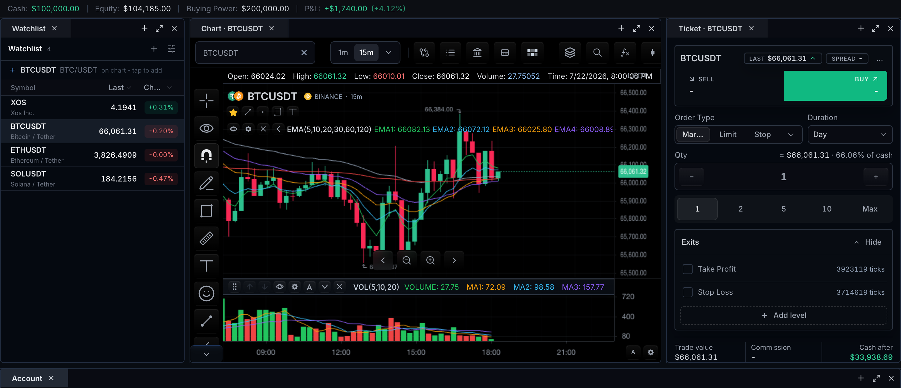
Region to API
| Visible region | Primary slot/customization | Keep owned semantics |
|---|---|---|
| Chart shell | chart-shell | Mount, focus boundary, chart lifecycle |
| Top period bar | period-bar | Built-in actions, state, responsive overflow |
| Drawing rail | drawing-sidebar | Tool IDs, active/disabled state |
| Pane header | pane-header | Indicator identity, values, pane actions |
| Price/time scale | price-scale / time-scale | Coordinates, labels, interaction |
| Standalone widget row | Formatter or documented render* prop | Selection, keyboard, subscriptions |
Anatomy: two close-ups
 The top toolbar. Every numbered region below sits inside the single
 period-bar slot.
- Symbol quick search — inside
period-bar - Interval selector and time-frame shortcuts — inside
period-bar - Compare, storage, and indicators entries — inside
period-bar - Chart type and range controls — inside
period-bar - Undo, timezone, screenshot, and fullscreen actions — inside
period-bar
A period-bar slot styles the whole strip. To show, hide, or reorder an individual control inside it, use its built-in control id (toolbar.quick-search, toolbar.interval-selector, ...) through ToolbarCustomization — see control composition.
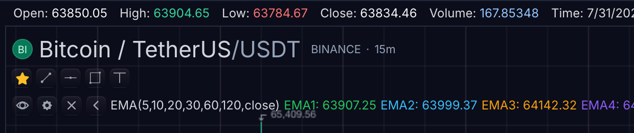 The pane legend. Every numbered region below sits inside the
 pane-header slot.
- Current OHLCV values and status row — inside
pane-header - Symbol identity (name, logo, exchange) — inside
pane-header - Indicator rows with per-indicator values — inside
pane-header - Visibility, settings, and remove controls per row — inside
pane-header
A pane-header slot styles the legend surface; indicator identity, values, and the row controls keep their own semantics.
The two props
Every chart surface takes the same two props:
<TradeScriptWidget
  sdk={sdk}
  symbol="AAPL"
  interval="1D"
  datafeed={datafeed}
  slotClassNames={{ 'period-bar': 'my-toolbar' }}
  slotStyles={{ 'chart-shell': { borderRadius: 0 } }}
/>
A slot is a value or a function
Pass a literal when the styling is fixed:
slotClassNames={{ 'drawing-sidebar': 'border-r border-slate-700' }}
Pass a function when it depends on the chart's state. It receives the surface, the active preset, and whether the chart is fullscreen:
slotStyles={{
  'chart-shell': ({ theme, fullscreen }) => ({
    borderRadius: fullscreen ? 0 : 8,
    outline: theme === 'light' ? '1px solid #e5e7eb' : 'none',
  }),
}}
Returning undefined from a function means "no opinion" — the surface keeps its own
styling. An unset slot is not the same as an empty string: an empty class would append
a stray token, and an empty style object would not.
Surface by surface
chart-shell
The outer chart frame, around everything else. Style it to square corners, add an outline, or blend the chart into a host panel.
slotStyles={{
  'chart-shell': ({ fullscreen }) => ({ borderRadius: fullscreen ? 0 : 8 }),
}}
Effect: the chart's outer frame gains an 8px radius in normal mode and squares off in fullscreen. Focus boundary and lifecycle are untouched.
period-bar
The top toolbar: symbol, interval, chart type, tools — the strip in the first close-up above.
slotClassNames={{ 'period-bar': 'my-toolbar' }}
Effect: my-toolbar is appended after the toolbar's own classes, so your equal-specificity rules win and hover/focus states remain available. Built-in actions, state, and responsive overflow keep working.
drawing-sidebar
The drawing-tool rail on the left edge of the chart.
slotClassNames={{ 'drawing-sidebar': 'border-r border-slate-700' }}
Effect: the rail gains a right border; tool ids and active/disabled states are untouched.
pane-header
A pane's legend row, including sub-pane headers — the second close-up above.
slotStyles={{ 'pane-header': { background: 'rgba(2, 6, 23, 0.35)' } }}
Effect: the legend surface takes a translucent tint behind values and indicator rows; the rows' visibility, settings, and remove controls keep their own semantics.
price-scale and time-scale
The vertical and horizontal axis regions. These two work differently — they are painted by the engine into the canvas, not rendered as DOM, so a class has nothing to attach to there.
Instead, the chart renders a dedicated layer over each axis region for these two slots to target. The layer covers exactly the axis bounds, and until you set something it paints nothing and captures no pointer events — an unset slot changes nothing about the chart.
That makes them right for borders, tints, gradients and overlays on the axis strip:
slotStyles={{
  'price-scale': { borderLeft: '1px solid rgba(148, 163, 184, 0.3)' },
  'time-scale': { background: 'linear-gradient(transparent, rgba(0,0,0,0.2))' },
}}
Effect: a hairline divider appears at the left edge of the price axis, and the time axis fades into a subtle bottom shade. Tick labels, coordinates, and axis interaction are untouched.
It does not let you restyle the tick numerals, gridlines or axis text — those are
canvas draw calls. Use the theme tokens for their colours, or
customization().applyStyleOverrides() for their geometry:
customization().applyStyleOverrides({
  xAxis: { tickText: { color: '#94a3b8', size: 11 } },
  yAxis: { axisLine: { show: true, color: 'rgba(148,163,184,0.28)' } },
})
Widget slots
The widgets take the same two props. Today there is one slot, root — the widget's
outermost element:
<WatchlistTable
  slotClassNames={{ root: 'rounded-none border-x-0' }}
  slotStyles={{ root: ({ theme }) => ({ outline: theme === 'light' ? '1px solid #e5e7eb' : 'none' }) }}
/>
Twelve widgets accept it: the data table, workspace tabs, market depth, time and sales, session badge, agent console, order-flow heatmap, watchlist, option chain, account summary bar, terminal action dialog and the trading terminal.
MobileChart is not among them — it is a chart, so it takes the chrome slots above
rather than widget slots.
Current widget-slot scope
The shared widget contract currently exposes only root. Use a widget's own
typed slot or style props when you need to target headers, rows, cells, tabs,
or other internal regions.
Widgets with bespoke regions already expose their own slot unions — the order ticket's 87 style slots, the account panel's tabs and rows, the level-2 ladder's 26. Those are documented on each widget's own page.
Formatters
A slot changes how a value looks. formatters changes what it says.
Every widget that shows a number formats it itself, which is right until your app
formats the same numbers differently — then the chart's prices and your prices disagree
on one screen. formatters hands that decision back:
<WatchlistTable
  formatters={{
    price: (value) => myApp.formatPrice(value),
    percent: (value) => `${value.toFixed(1)}%`,
  }}
/>
Six fields, all optional: number, price, quantity, currency (which also receives
the currency code), percent, and time (milliseconds). An unset field keeps the widget's
own locale-aware default, so overriding price alone does not oblige you to re-supply
the rest.
Your function is only ever called with a finite number. Absent, NaN and infinite
values render the widget's placeholder without reaching you, so (value) => value.toFixed(2) is safe to write as-is.
| Widget | number | price | quantity | currency | percent | time |
|---|---|---|---|---|---|---|
ChartDataTable | — | numeric columns | — | — | — | time column |
WatchlistTable | — | last/bid/ask/change | volume | — | change % | — |
TimeAndSalesWidget | — | print price | print size | — | — | timestamp |
OptionChainLadder | Greeks and numeric custom metrics | last/mark/bid/ask/strike | volume/OI | — | IV | — |
BrokerAccountSummaryBar | — | — | — | cash/equity/buying power/P&L | P&L % | — |
MarketDepthWidget | — | formatPrice | formatSize | — | — | — |
MarketDepthWidget predates this contract and keeps its original formatPrice /
formatSize props rather than breaking them.
BrokerAccountPanel is deliberately absent: it already has customFormatters, a
richer per-column registry. Two formatter mechanisms on one widget would be worse than
one.
Render overrides
When a class and a formatter are not enough, some widgets let you replace a repeated
region outright. Each override receives that region's data and the widget's own
output as defaultRow, so wrapping costs one line and does not make you reimplement
selection, drag, keyboard handling or the column grid:
<WatchlistTable
  renderRow={({ symbol, quote, defaultRow }) => (
    <div className={quote?.halted ? 'opacity-50' : undefined}>{defaultRow}</div>
  )}
/>
Ignore defaultRow and you have replaced the row entirely:
<TimeAndSalesWidget
  renderPrint={({ entry, aggressor }) => (
    <tr><td>{aggressor} {entry.size} @ {entry.price}</td></tr>
  )}
/>
| Widget | Prop | Region |
|---|---|---|
WatchlistTable | renderRow | one quote row |
MarketDepthWidget | renderLevel | one ladder row, bid and ask paired |
TimeAndSalesWidget | renderPrint | one tape print |
AgentConsoleWidget | renderCapabilities | the expanded capability view |
(chart.setOrderFlowHeatmap({ renderMode }) is not one of these — it selects a
chart-layer draw style, not a replacement renderer.)
Use render overrides only for the documented regions above. Other widget regions retain their built-in rendering and interaction behavior.
Which columns, which rows, how dense
A few widgets let you choose what is shown rather than how it looks. These are ordinary props, not slots, because they change layout rather than appearance:
<ChartDataTable density="compact" />

<BrokerAccountSummaryBar metrics={['equity', 'pnl']} />

<OptionChainLadder sdk={sdk} columns={['bid', 'ask']} />
ChartDataTable.density—comfortable(default, 32px rows) orcompact(24px). It drives the virtualiser as well as the row height, so compact genuinely renders more rows rather than clipping them.BrokerAccountSummaryBar.metrics— which ofcash,equity,buyingPower,pnlto show, in your order. A metric with no data is still skipped, so listing one never forces an empty slot.OptionChainLadder.columns— which oflast,volume,bid,askto show per side, in your order. It also acceptsmark,openInterest,impliedVolatility,delta,gamma,theta,vega, andrho, plus declarative customer metric columns. The call side mirrors your order so both halves stay symmetric about the strike, except that bid always reads before ask on both sides — a trader scanning across should not find the two prices transposed halfway.
Customer metrics ride on each option quote and are never calculated by the widget:
Custom option-chain metric columns example
import type { OptionChainColumnSpec } from '@tradescript/pro/react/widgets/option-chain';

const columns: readonly OptionChainColumnSpec[] = [
  'last',
  'impliedVolatility',
  'gamma',
  {
    kind: 'metric',
    metric: 'vanna',
    label: 'Vanna',
  },
  {
    kind: 'metric',
    metric: 'gex',
    label: 'GEX',
    renderCell: ({ value }) =>
      typeof value === 'number' ? value.toLocaleString() : '-',
  },
  'bid',
  'ask',
];

const quote = {
  contract,
  bid: 4.2,
  ask: 4.3,
  impliedVolatility: 0.274,
  gamma: 0.0237,
  metrics: {
    vanna: 0.0114,
    gex: 838919,
  },
};

<OptionChainLadder sdk={sdk} columns={columns} {...props} />;
OPTION_CHAIN_BUILT_IN_COLUMNS is the runtime catalog for building a host-side
column chooser. Wider configurations use one synchronized horizontal scroll surface,
so call headers, strike rows, and put headers stay aligned.
Precedence
Your slot class is appended after the surface's own classes, so equal-specificity rules win. Your slot style is spread after the surface's own inline style, so it overrides it. Between the two, prefer the class — it keeps hover and focus states available, which an inline style cannot express.
Slots never change behavior. They set appearance only: a slot cannot hide a control,
reorder a toolbar, or alter what an action does. Use ToolbarCustomization for that —
see Feature Gates.
Related pages
- Feature Gates — hiding, showing, and composing controls rather than restyling them.
- Themes — the token layer slots sit on top of.
- Customization Precedence — where slots rank against themes and overrides.
- Toolbars — the toolbar anatomy these slot keys attach to.