Customization And Styling
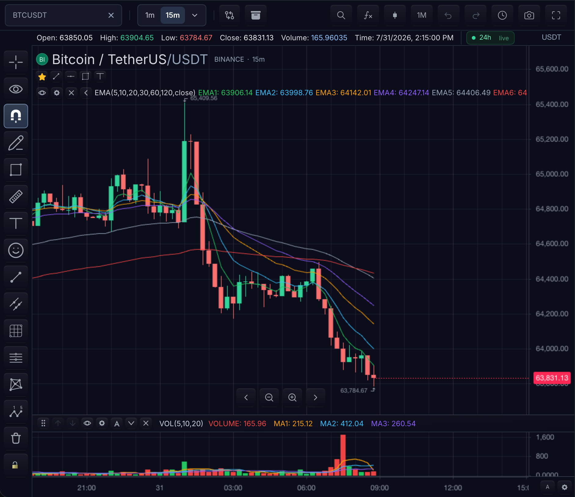
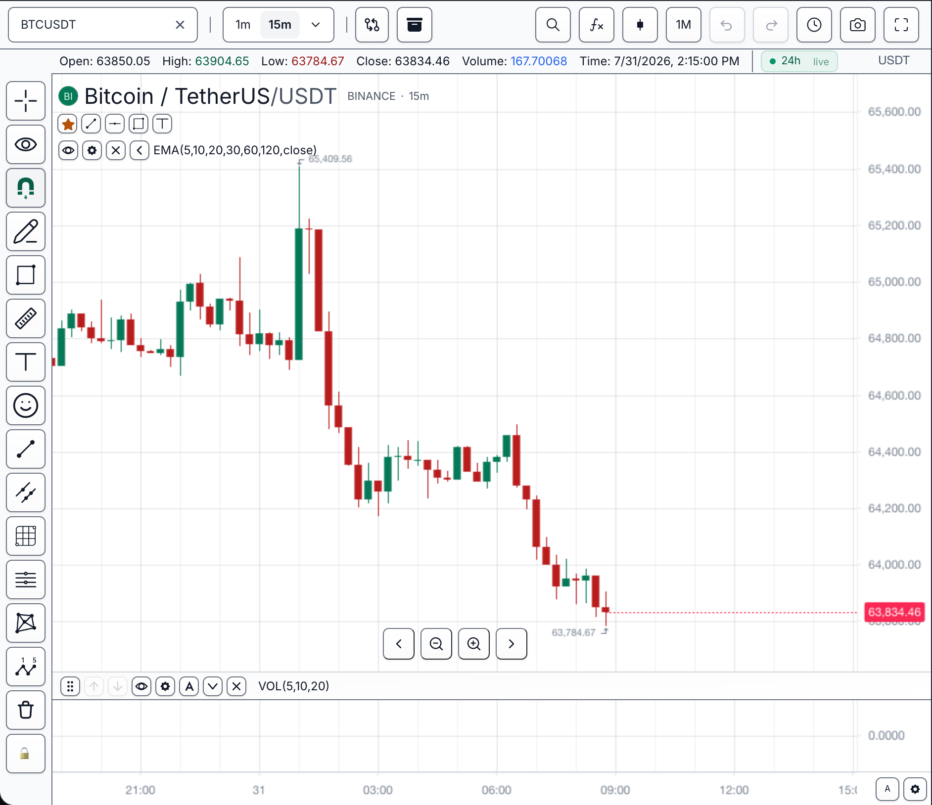
TradeScript Pro Charts uses typed customization contracts across themes, chart settings, component styles, and feature policy. One theme call is the difference between the two states below — the chart state itself (symbol, interval, indicators, drawings, data) is untouched:
Choose a mechanism
Five mechanisms cover styling and capability. Start from what you want to change:
| You want to... | Mechanism | Visual example |
|---|---|---|
| Swap the entire skin at once — canvas, chrome, and widgets | Themes — one preset id or one theme object | The dark/light pair above; both states on Themes |
| Retune individual UI tokens — one button color, one focus ring, one font | CSS Variables — ChartTheme.ui fields mapped to --ts-chart-* tokens | Token groups by visual target on CSS Variables |
| Change specific chart values — grid color, candle colors, crosshair, session shading | Overrides — applyOverrides / applyStyleOverrides | Each override group's visible result described on Overrides |
| Attach your own class or style to the chart's own furniture — toolbar, rail, scales | Chrome Slots — slotClassNames / slotStyles | Annotated toolbar and legend anatomy on Chrome Slots |
| Show or hide product capabilities — search, drawings, indicators, templates | Feature Gates — features on the widget options | Gate-by-surface matrix on Feature Gates |
The five are not alternatives to one another — they stack. A theme supplies everything, overrides pin individual chart values above it, CSS variables retune single UI tokens, chrome slots attach your own classes to the chart's furniture, and feature gates decide what exists at all:
Read it bottom-up: the theme fills in every value, and each layer above it replaces only the keys it actually sets. When two mechanisms set the same property, Customization Precedence defines the winner. For "my setting is not applied" cases, use Customization Troubleshooting.
Detailed routing
| Need | Use |
|---|---|
| Enable or hide product capabilities | features on ChartWidgetOptions |
| Set the base visual skin | theme on ChartWidgetOptions |
| Brand runtime boot, initial data, and history fetching | loading on ChartWidgetOptions |
| Change theme at runtime | chart.customization().setTheme(...) |
| Set chart, series, grid, axis, and session styling | chart.customization().applyOverrides(...) |
| Set indicator, drawing, handle, candle, text, and low-level style groups | chart.customization().applyStyleOverrides(...) |
| Set candle colors with a dedicated helper | chart.customization().setCandleColors(...) |
| Set watermark, legend, toolbar, context menu, locale, timezone, shortcuts, and tooltip formatting | chart.customization() |
| Seed customization when the chart is created | initialState.customization |
| Persist user preferences | storage plus features.userSettings |
Runtime Shape
Everything is reachable from one controller:
const ui = chart.customization();

ui.setTheme('dark');
ui.setTimezone('America/New_York');
ui.setLegend({ visible: true, showIndicatorRows: true });
ui.setWatermark({ autoText: { tickerVisible: true, intervalVisible: true, descriptionVisible: true } });
ui.setCandleColors({ up: '#16a34a', down: '#dc2626' });
ui.applyOverrides({ grid: { horizontal: { color: '#1f2937' } } });
ui.applyStyleOverrides({ handles: { color: '#1677FF' } });
Constructor Shape
Full constructor example: theme, branded loading phases, feature gates, and seeded customization
sdk.chart.mount({
  mount: '#chart',
  symbol: 'AAPL',
  interval: '1D',
  datafeed,
  theme: {
    name: 'broker-dark',
    colors: {
      background: '#071018',
      grid: '#1f2937',
      text: '#dbeafe',
      up: '#16a34a',
      down: '#dc2626',
    },
    fontFamily: 'Inter, system-ui, sans-serif',
  },
  loading: {
    runtime: {
      text: 'Loading broker workspace',
      backgroundColor: '#071018',
      foregroundColor: '#dbeafe',
      accentColor: '#38bdf8',
      indicator: { type: 'image', url: '/broker-mark.svg', size: 36 },
    },
    initialData: {
      text: 'Loading market data',
      indicator: { type: 'image', url: '/broker-mark.svg', size: 32 },
    },
    history: {
      text: 'Loading history',
      placement: 'top-left',
      indicator: { type: 'image', url: '/broker-mark.svg', size: 20 },
    },
  },
  features: {
    symbolSearch: { showLogos: true, showExchangeLogos: true },
    drawings: true,
    builtInIndicators: true,
    contextMenu: true,
    templates: true,
    userSettings: true,
  },
  initialState: {
    customization: {
      chartOverrides: {
        grid: { horizontal: { color: '#1f2937' }, vertical: { color: '#1f2937' } },
      },
      styleOverrides: {
        candles: {
          bar: {
            upColor: '#16a34a',
            downColor: '#dc2626',
          },
        },
      },
      legend: { visible: true, showValues: true },
      watermark: {
        autoText: true,
        color: '#94a3b8',
        opacity: 0.14,
      },
    },
  },
});
Image indicators default to a gentle pulse, fall back to the built-in ring if
the image cannot load, and become static when the user's reduced-motion
preference is enabled. Set any phase to false to disable it, or pass
loading: false to disable all three. The deprecated loadingScreen option
continues to configure runtime boot only.
Next steps
- Themes — shipped presets and building a custom theme on a preset base.
- Feature Gates — which controls and workflows the product offers at all.
- Customization Precedence — which layer wins when two of them set the same property.
- Customization Troubleshooting — symptom-first fixes when a value is stored but not visible.