Customize the Terminal
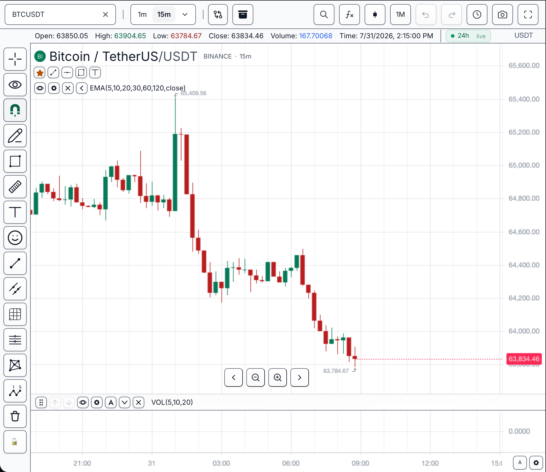
Terminal appearance is set in two places, and the split is deliberate. Construction options fix product policy and the first paint. The customization controller owns every change after the widget is ready. Layers rank explicitly, so a value set at the wrong point is outranked rather than lost — see Customization Precedence.
Target terminal
Every code section below is labeled with the region of this target it controls.
| Region | What you see | Set it with | Step |
|---|---|---|---|
| A — Toolbar and chrome | Which controls exist above and beside the chart | features | 1 |
| B — Legend rows | OHLCV values and indicator rows over the pane | ui.setLegend(...) | 2 |
| C — Watermark | Faint ticker/interval text behind the series | ui.setWatermark(...) | 2 |
| D — Candles | Up and down body colors | ui.setCandleColors(...) | 3 |
| E — Grid lines | Horizontal and vertical rules behind the series | ui.applyOverrides(...) | 3 |
| Overall palette | Background, axes, chrome, and every UI token | theme | 1 |
Choose the correct customization layer
| Need | Use | Why |
|---|---|---|
| Decide which product capabilities exist | features | Product policy should be explicit at construction |
| Choose the initial visual system | theme or initialState.customization | The first paint should not depend on a later mutation |
| Respond to a live user action | widget.customization() or chart.customization() | Runtime changes stay observable and scoped |
| Restore user preferences | Storage/user settings | Persistence should not be hidden in theme defaults |
1. Set product policy and initial theme (regions A and palette)
const mounted = sdk.chart.mount({
  mount: '#terminal',
  symbol: 'AAPL',
  interval: '15m',
  datafeed,
  theme: 'dark',
  features: {
    symbolSearch: true,
    drawings: true,
    builtInIndicators: true,
    contextMenu: true,
  },
});
Checkpoint: the first rendered frame uses the dark theme and only the enabled product capabilities are visible.
2. Apply runtime presentation changes (regions B and C)
Wait for ready() so the customization controller owns a mounted surface.
const widget = await mounted.ready();

const ui = widget.customization();
ui.setLegend({ visible: true, showIndicatorRows: true });
ui.setWatermark({
  autoText: { tickerVisible: true, intervalVisible: true, descriptionVisible: false },
  opacity: 0.12,
});
Checkpoint: region B shows legend rows including indicator rows, and region C shows a faint ticker-and-interval watermark at 12 percent opacity.
3. Apply colors and overrides (regions D and E)
ui.setCandleColors({ up: '#16a34a', down: '#dc2626' });
ui.applyOverrides({
  grid: { horizontal: { color: '#1f2937' } },
});
Checkpoint: region D renders up candles in the configured green and down candles in the configured red, and region E shows horizontal grid lines in the override color while vertical lines keep the theme default.
4. Decide persistence
Runtime calls on widget.customization() change the mounted widget only. To make user preferences survive a reload, persist them through the storage and user-settings lane described in User Settings; to make branding survive a reload without storage, put it in theme or initialState.customization at construction.
Checkpoint: after a reload, construction-time values return and runtime-only changes disappear unless the user-settings lane persisted them.
Verification
- Disabled features do not leave empty toolbar gaps.
- Text, grid, candles, and watermark remain readable in dark and light modes.
- A runtime change updates the current widget only.
- Reload behavior matches the chosen storage/user-settings policy.
- Conflicting values resolve according to Customization Precedence.
Complete typed example
import { createTradeScriptSdk, type MarketDataFeed } from '@tradescript/pro/sdk/core';

declare const datafeed: MarketDataFeed;
declare const deploymentLease: string;

const sdk = await createTradeScriptSdk({ lease: deploymentLease });
const mounted = sdk.chart.mount({
  mount: '#terminal',
  symbol: 'AAPL',
  interval: '15m',
  datafeed,
  theme: 'dark',
  features: {
    symbolSearch: true,
    drawings: true,
    builtInIndicators: true,
    contextMenu: true,
  },
});

const widget = await mounted.ready();
const ui = widget.customization();
ui.setLegend({ visible: true, showIndicatorRows: true });
ui.setWatermark({
  autoText: { tickerVisible: true, intervalVisible: true, descriptionVisible: false },
  opacity: 0.12,
});
ui.setCandleColors({ up: '#16a34a', down: '#dc2626' });
ui.applyOverrides({ grid: { horizontal: { color: '#1f2937' } } });
Next steps
- Styling — choose between themes, CSS variables, overrides, chrome slots, and feature gates.
- Themes — shipped presets and building a custom theme on a preset base.
- Chrome Slots — attach your own classes and styles to the chart's furniture.
- Customization Precedence — which layer wins when two of them set the same property.